Branding.
Strategic brand building with impact.
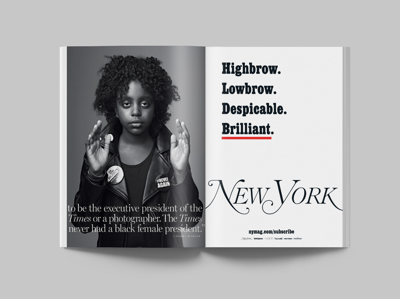
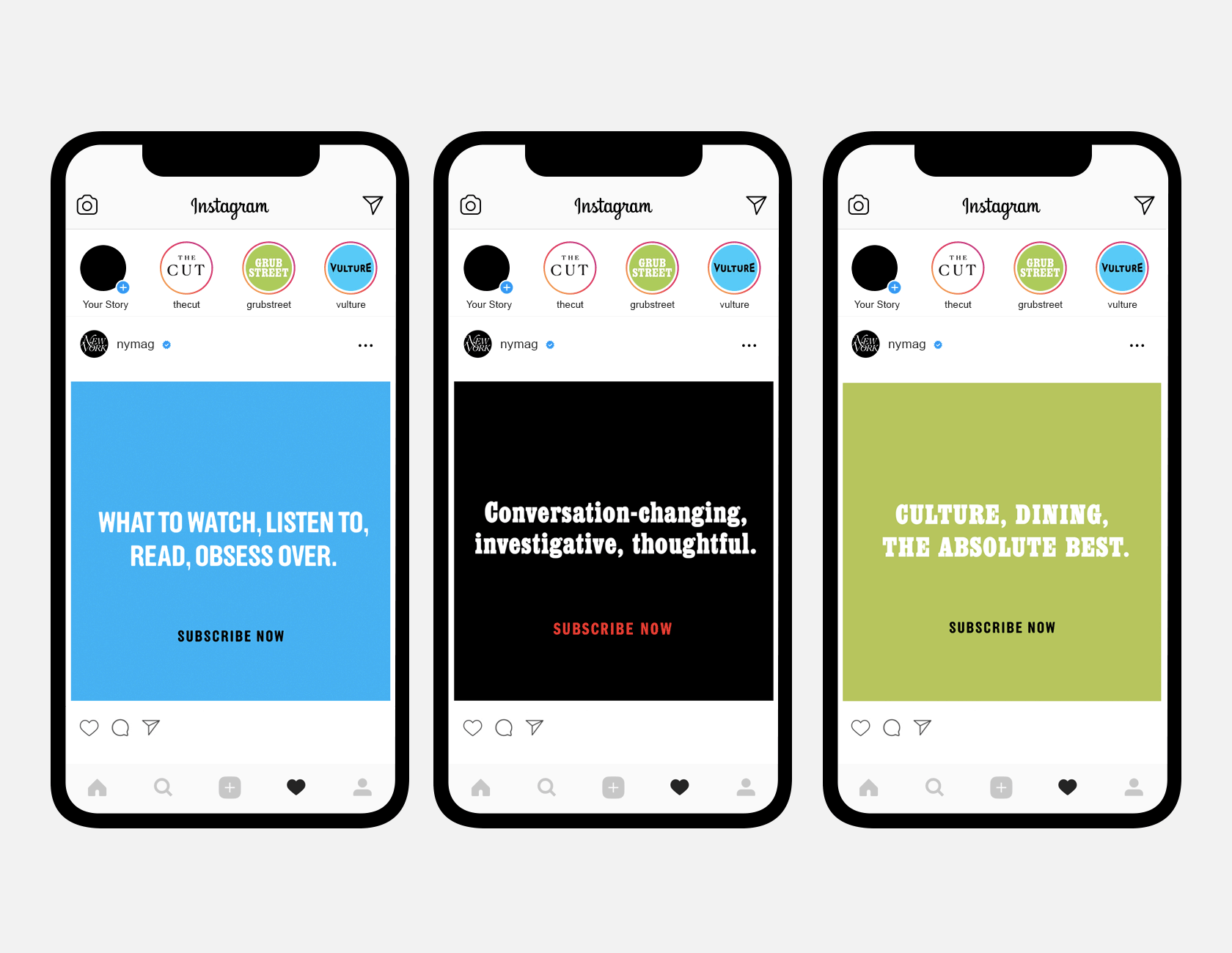
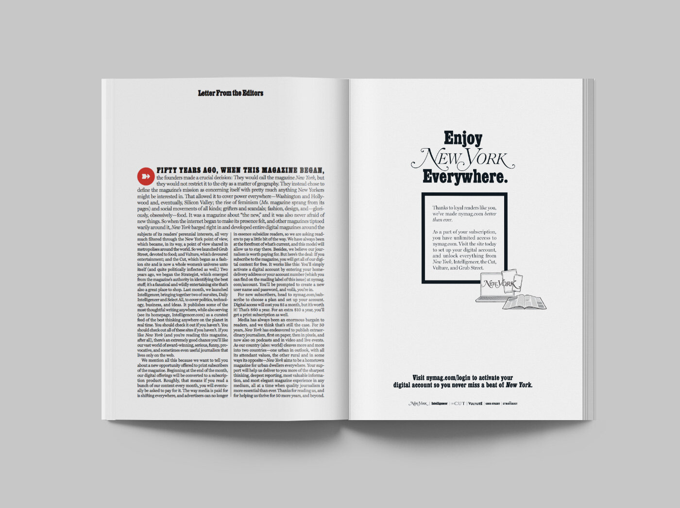
New York Magazine
Simplifying the New York brand and taking it back to its roots for New York Magazine’s 50th anniversary and their highly successful subscription services campaign. Creative included print, web, display ads, social, and all onboarding emails.


Piccolo
Classic Italian typographic signage and midcentury European art & design provide the inspiration for this Italian-influenced wine and cocktail bar.
A bespoke typeface, abstract pattern and hand painted illustrations appear across all elements of the brand, including lightbox signage, plates, menus, postcards, coasters and matchbooks.


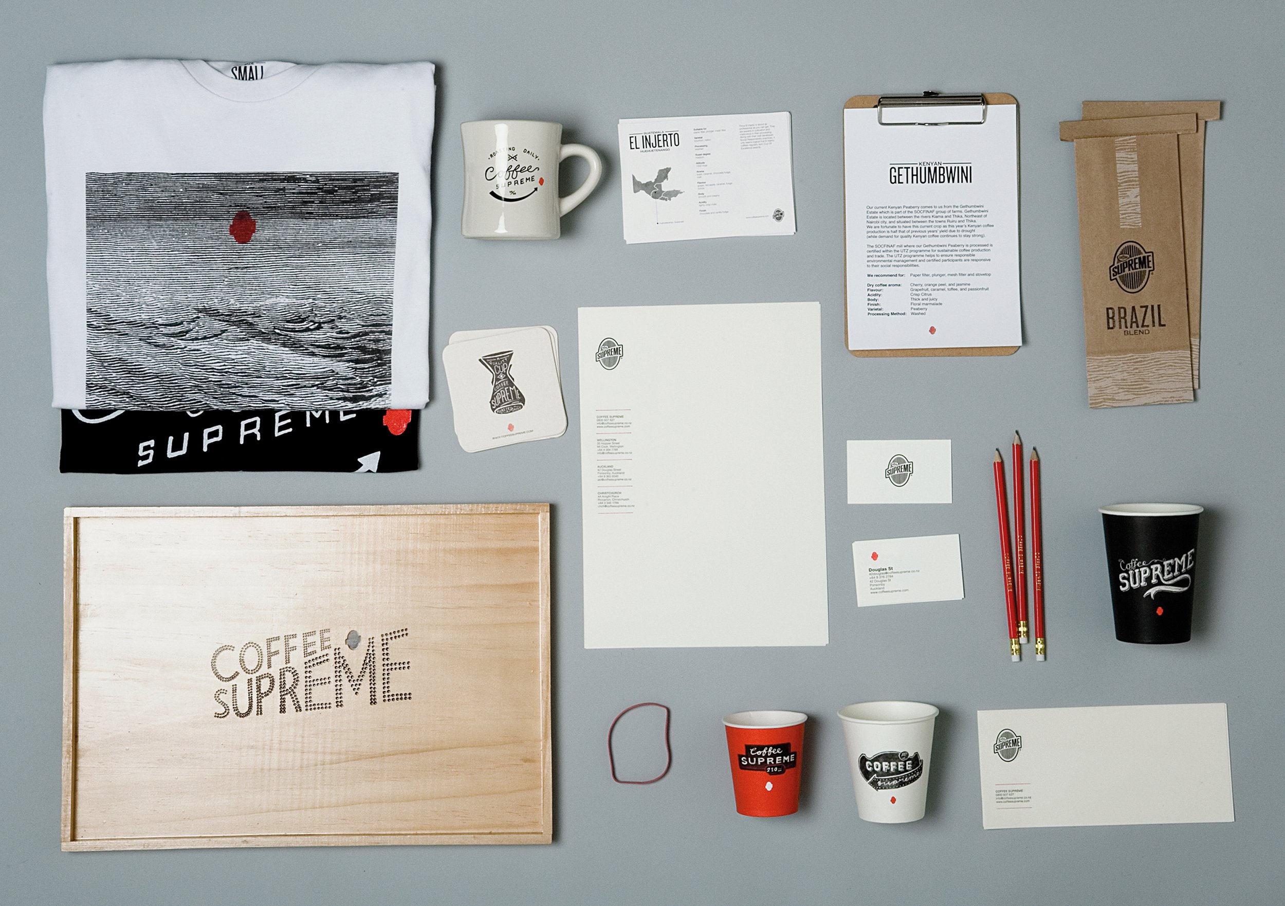
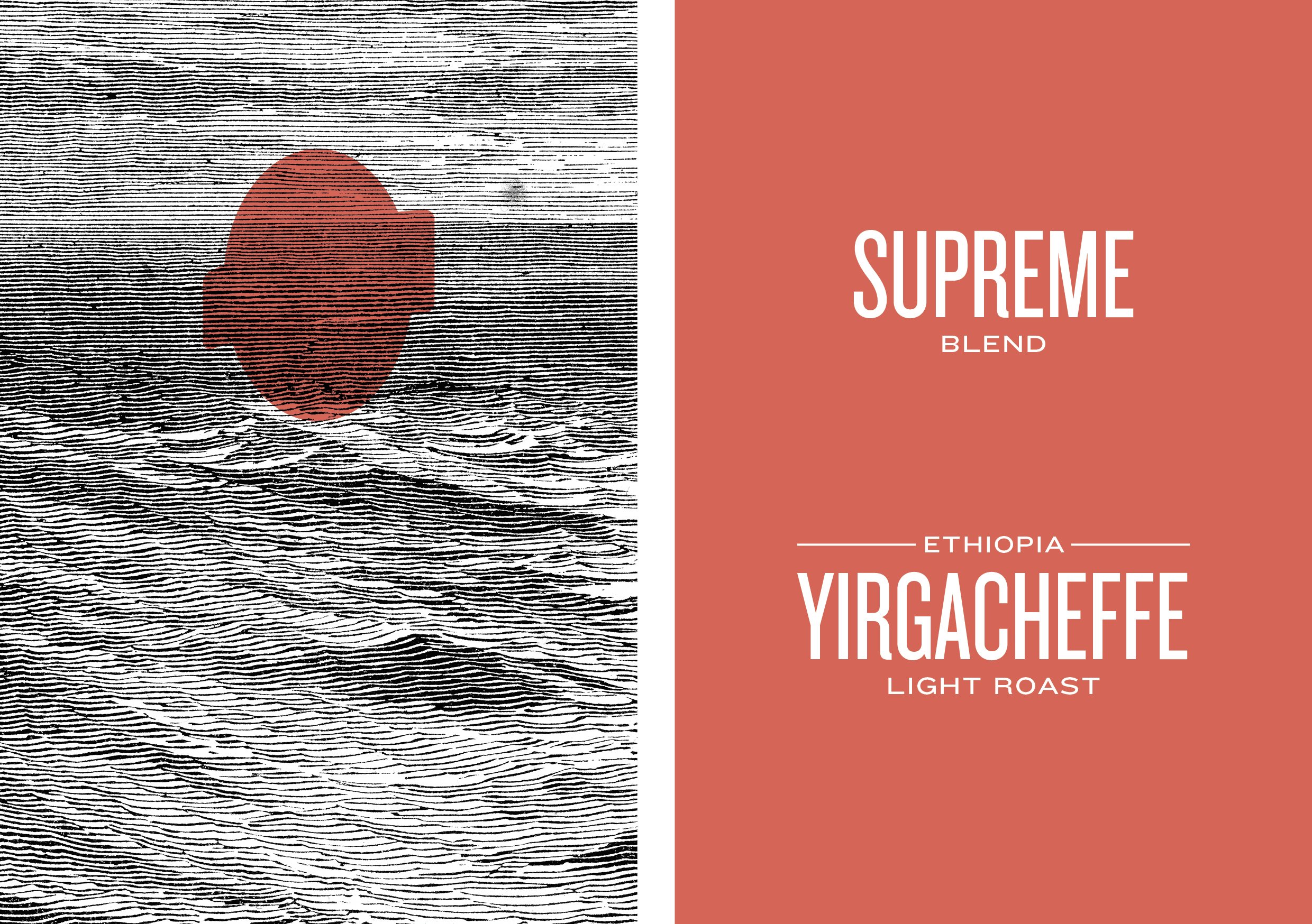
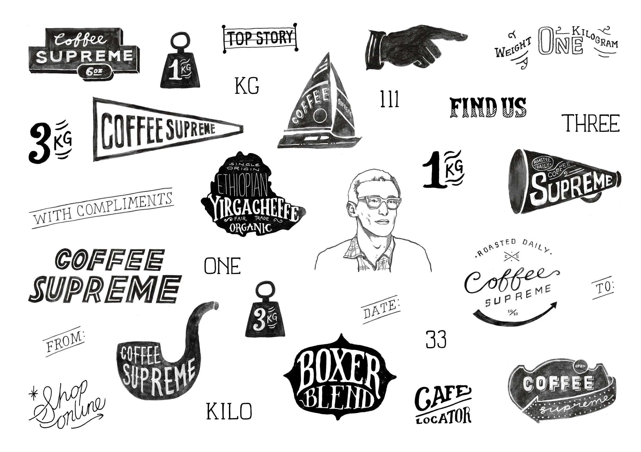
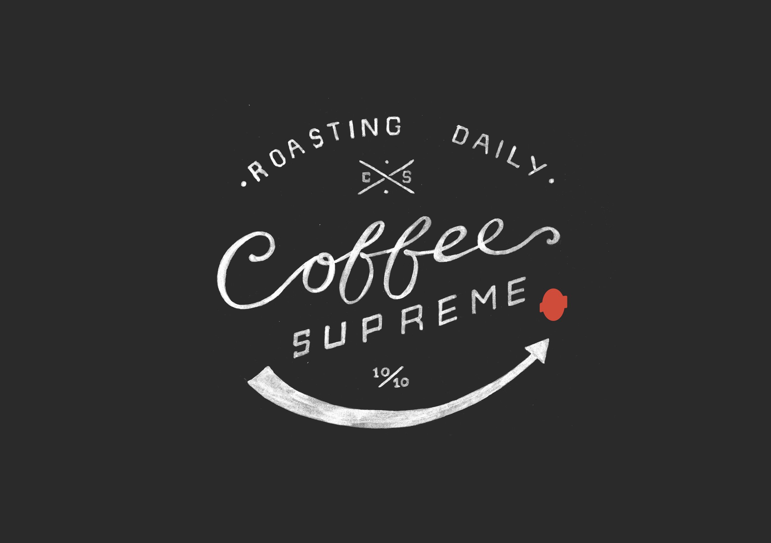
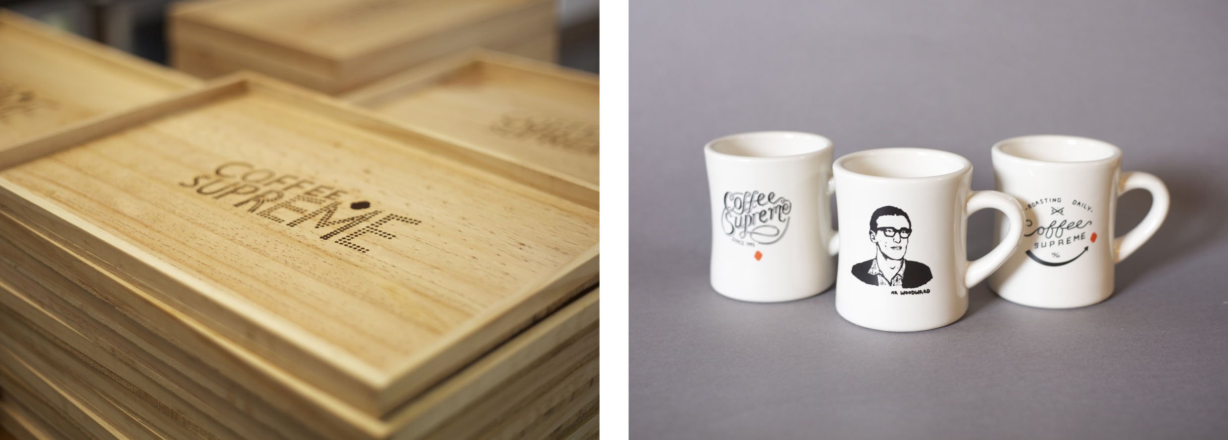
Coffee Supreme
A hand-crafted focus to re-engage customers for the multiple territory rebrand of one of New Zealand’s best and largest independent coffee roasters & suppliers.
Winner of the Dieline Packaging Award and NZ Best Design Award.
Featured in Novum Magazine, Idealog Magazine, Lovely Package, The Dieline, StopPress, Designers Journal and design books by Ginko Press, Gestalten, SendPoints & ArtPower.


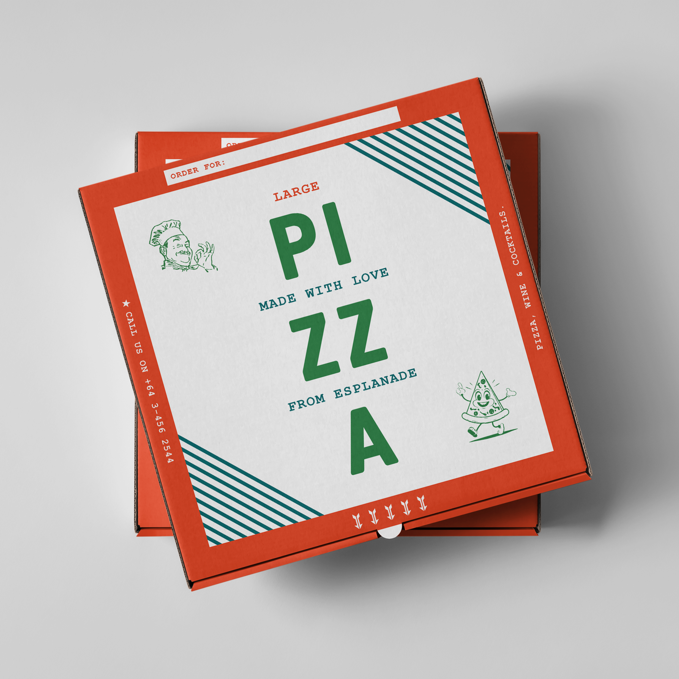
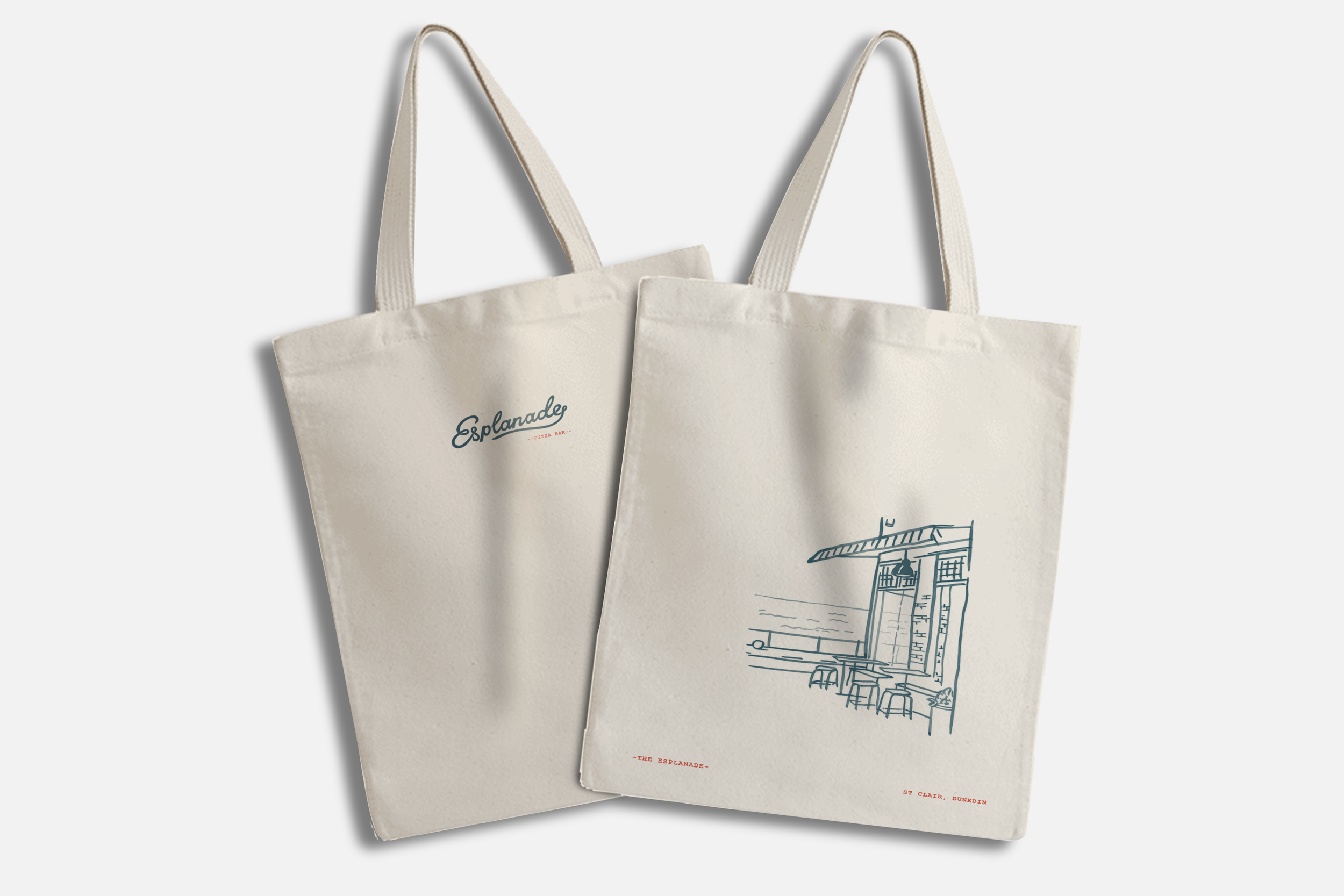
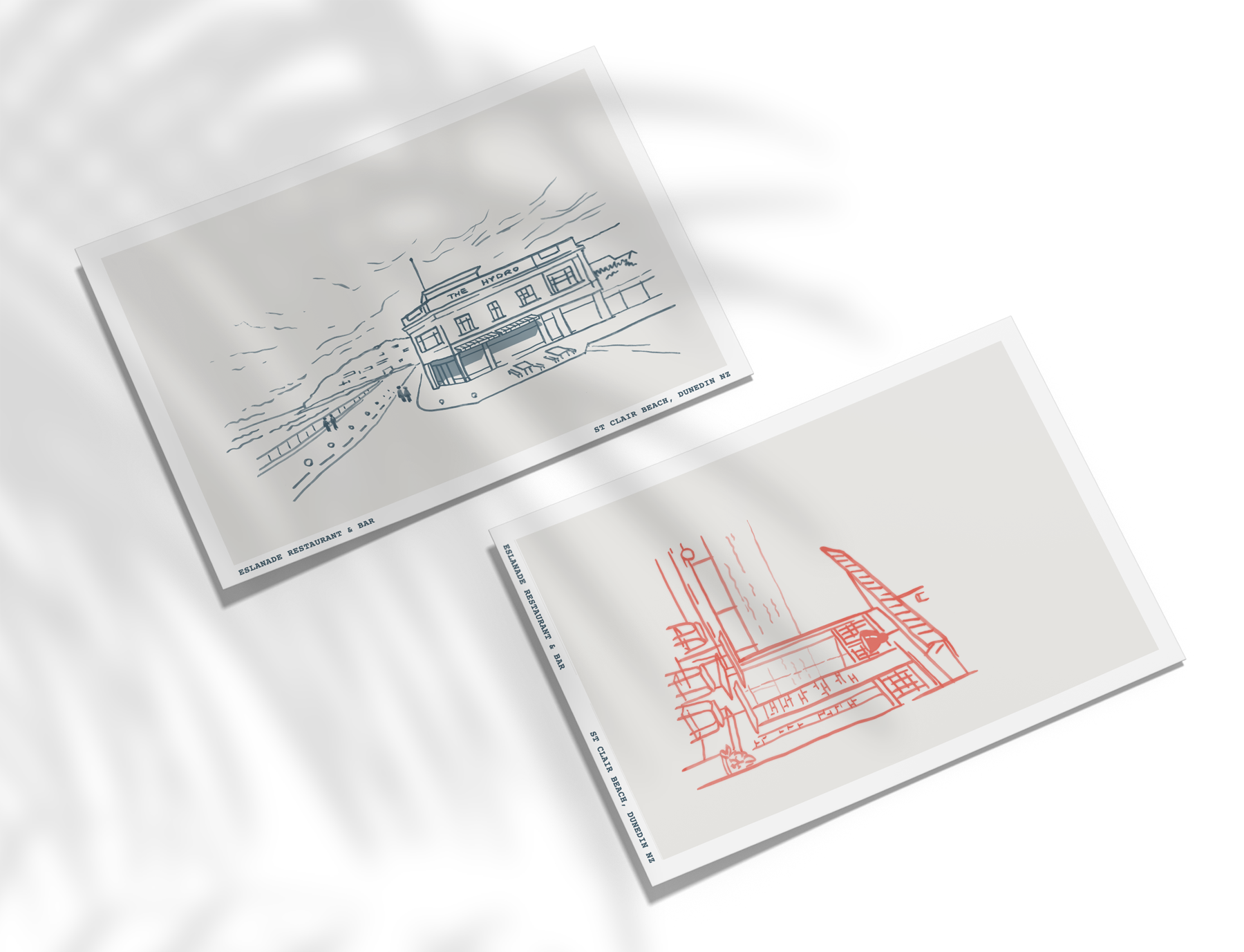
Esplanade
Beach clubs of a bygone era provide inspiration for this modern take on a classic seaside Italian restaurant and bar. Full brand, logo, typography, packaging, print & digital.

The Londoner
A bold identity for London’s new quality newspaper.
With journalists who have written for the Financial Times, the Guardian, the New Statesman, New Yorker, the Observer, Private Eye, Prospect, and the Sunday Times, The Londoner aims to bring bold, quality journalism and in-depth reporting to the capital city and beyond. Full brand, logo, typography, web & social design.


Diana Health
A network of modern health practices on a mission to set a new standard of care that empowers, inspires & supports women to live healthier, more fulfilling lives. Full brand, logo, monogram, typography, graphic toolbox of custom icons, web, print & social.


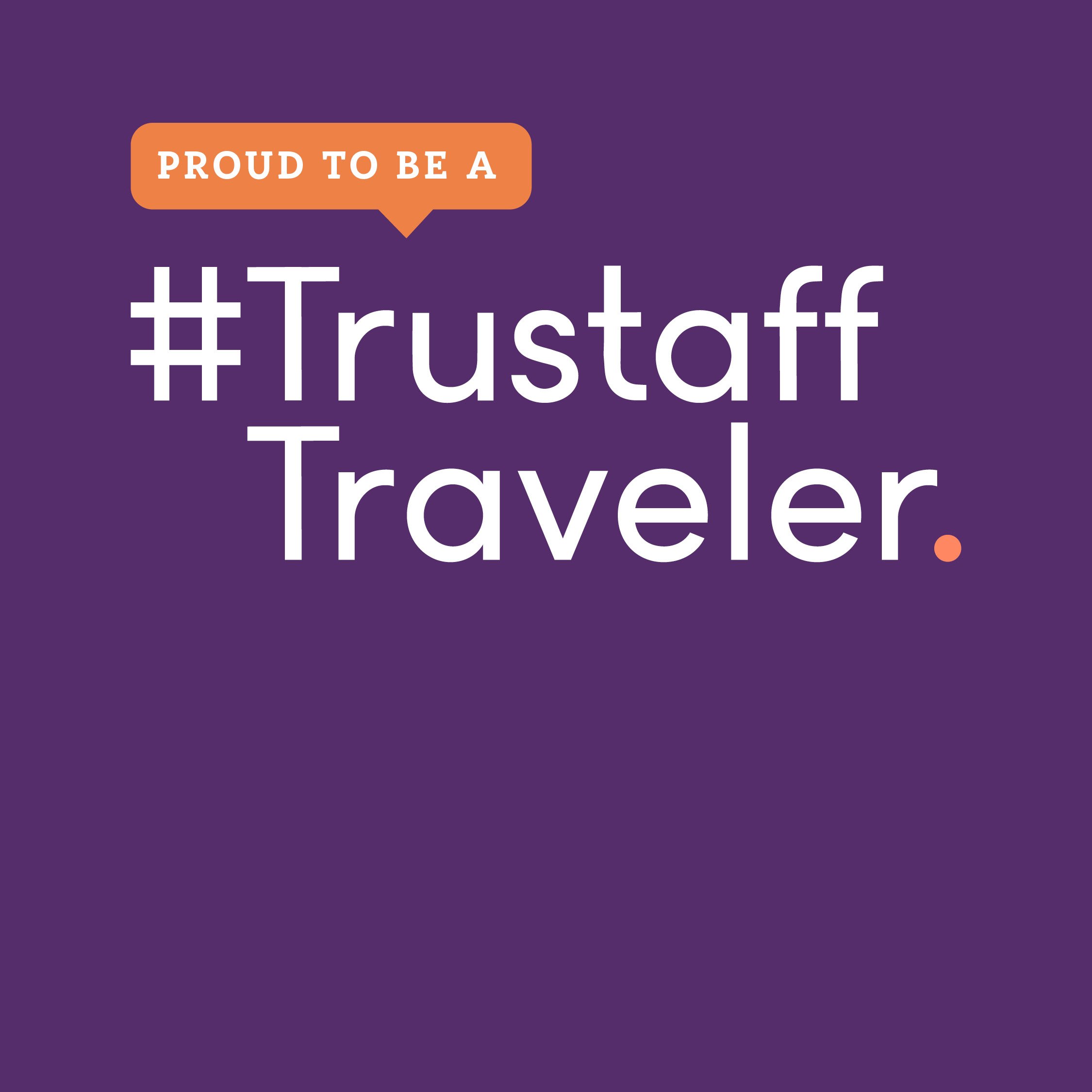
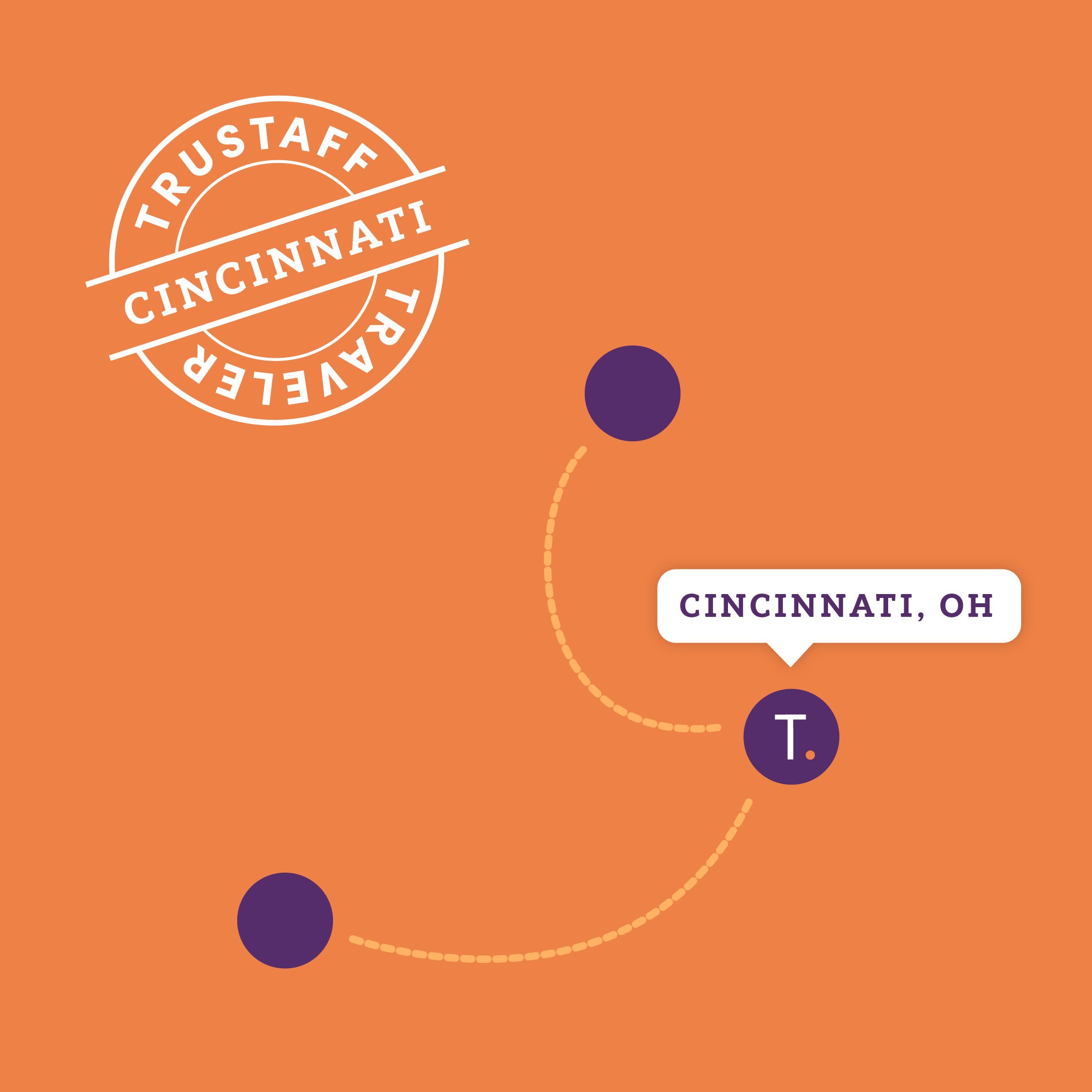
Trustaff
Rebrand for a leading force in healthcare staffing with a messaging focus on the benefits of travel as part of the job. The rebrand included new logo, type, color, brand graphics, print, web, social, deck and presentation design, as well as photographic style direction and a comprehensive brand book. Produced with Burns Group.


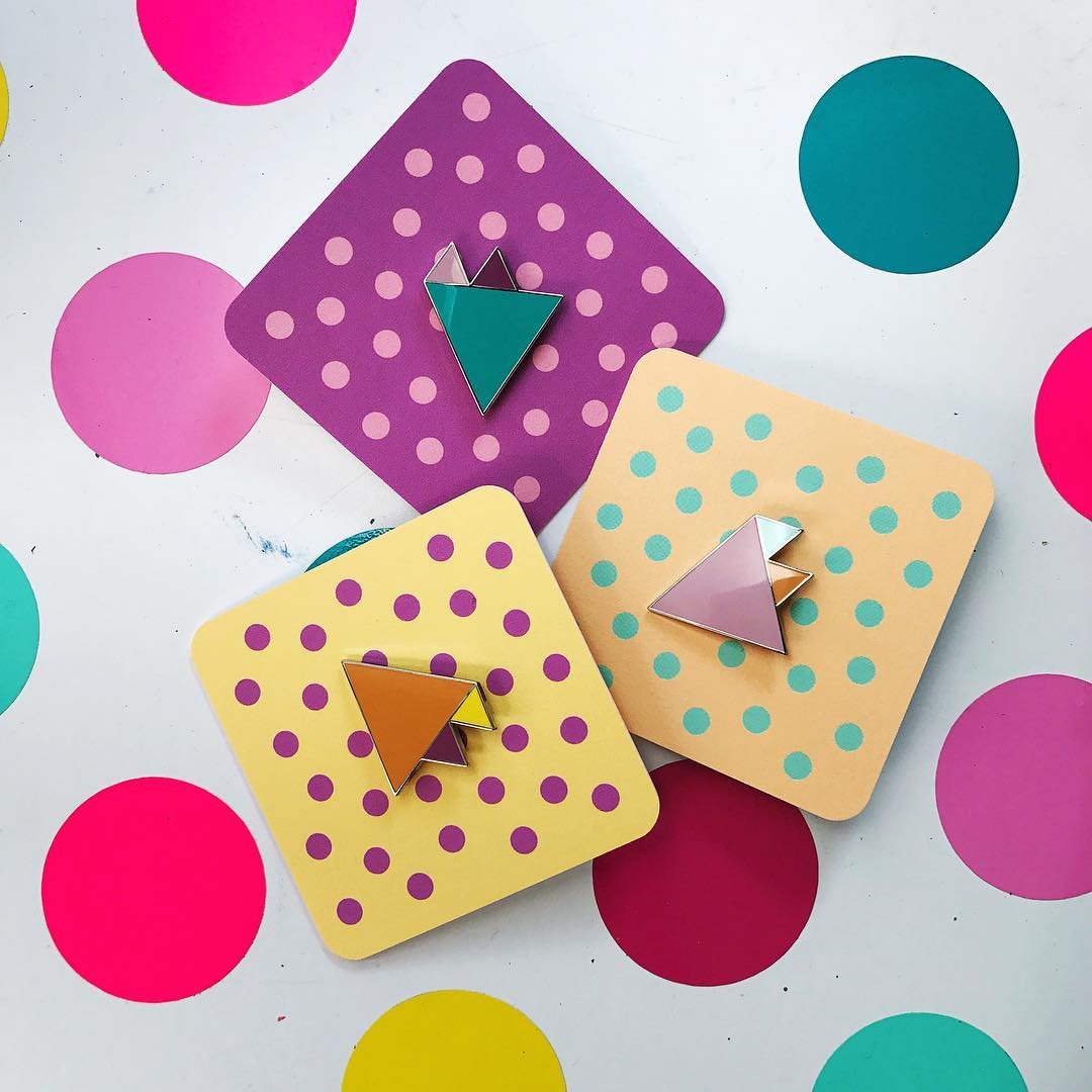
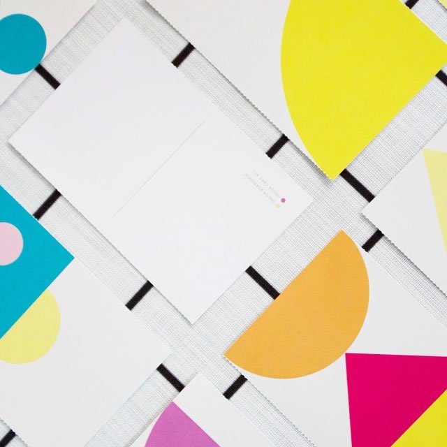
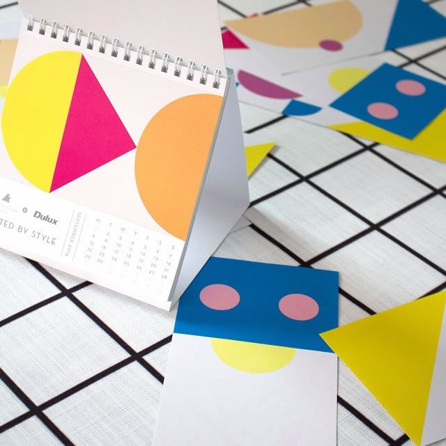
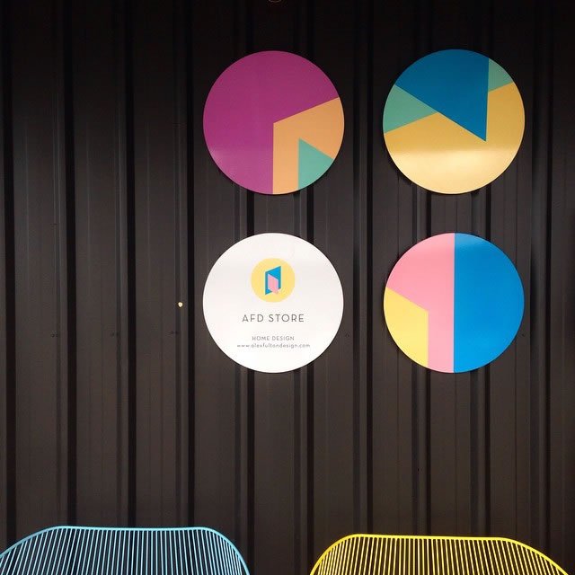
Alex Fulton Design
Strong color and interchangeable shapes create a highly flexible brand for an interior designer known for her bold use of colour and pattern and a light-hearted approach to her work. Her online store is relaunched each season with a unique collection of items curated around a color theme, designed and built to allow for a seamless and complete color overhaul to reflect each season via a simple custom built content management system.


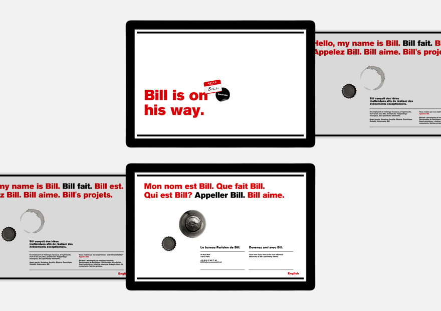
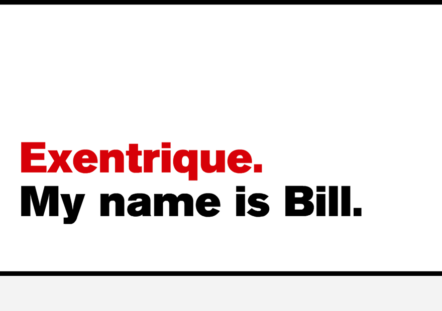
Hello My Name Is Bill
Heavy type, strategic use of whitespace, and a collection of simple circular photographic elements — the leftover remains from a party (extinguished candles, vinyl records, ashtrays, wine stains, empty bottles and glasses, bottle tops, corks) all shot in black & white from directly above — come together to form a bold & ballsy identity for an edgy and rebellious Parisian events company. With founders from both Paris & London, and an international client base, the site was in both French & English, with a a horizontal swipe allowing users switch between the two.